
Reverse engineering Adobe's Pantone black-out
Adobe is putting Pantone behind a monthly subscription and turning existing artwork black. But how are they going to do it?
It was a boring day for me, when Adobe announced that they would put their Pantone swatches in Adobe Photoshop, Adobe Illustrator and Adobe InDesign behind a paywall. I have seen a post by Iain Anderson and thought “hold on, they want to sell a monthly subscription for a set of color codes?”.
Well, it turned out to be not that simple.. And not that smart either..
What’s PANTONE anyway?
You may have heard PANTONE’s “Color of the year” campaign, which is actually a clever advertisement campaign for their physical swatches.
PANTONE, to put simply, is a company that develops and distributes a standard set of color swatches. These colors are basically the standard for any print based work. What makes PANTONE special is that they actually check the color perception between different materials. That way, a big company can base their brand colors on PANTONE and (assuming they work with PANTONE certified companies) will get that same exact shade of orange on their tshirts, flyers or even their headquarter logo.
And what has Adobe to do with this?
As you may have guessed, PANTONE likes to get paid A LOT for this standard. So much so, that they seemingly decided to go into negotiations with Adobe, which ships a subset of PANTONE swatches in their software for ease of use to get paid even more.
Well, from what we can see from the outside, Adobe doesn’t seem too interested to change the deal. After all, their $60 /month subscription could never cover this huge overload of cost… Or maybe they just want to keep more of that sweet sweet early-cancel fee?
Either way, Adobe decided to push these negotiations into the next level, by leveraging their customers, with the best weapon there is: fear.
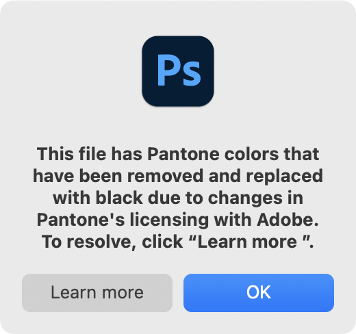
Black out? What does that mean?
The fun thing is: we don’t know, yet. While Adobe’s support page announced that PANTONE colors other than “CMYK Coated”, “CMYK Uncoated” and “CMYK Metallic” will disappear starting November 2022, this message is all we have for now.
So I decided to do a little digging
Iain highlighted a really serious concern, what happens with old files. What happens with my files from 10 years ago, will they be visually changed? Will Adobe actually go as far as to break my existing backlog of files, even if I just used these PANTONE swatches for their balanced color palette?
#111 is one of my favorite colors. It is my go-to “not quite black” that I use for most dark-ish layouts these days. According to PANTONEs color finder, this maps to the named color Dreamless Sleep. So I asked myself: What happens, when I use the hex value of a PANTONE color?
While we cannot know how Adobe will pull this off, I predict they will simply remove those swatches and switch them out for links to a popup prompting you to pay them more money. So I tested removing the currently existing PANTONE swatches.
If we assume Adobe will just straight up remove the PANTONE color swatches, we can compare a file with and without those swatches and see how they will potentially change with their “black out”.
Testing Method
Both .ai and .eps files are largely ASCII encoded under the hood. They are PostScrip-flavoured and can be easily diff-checked with simple text tools.
My test included three test files. For each of them, I’ve checked their file content (and visual render) both with and without the PANTONE color swatches present.
The test matrix
| File | What it is |
|---|---|
| FileA | Pantone swatch applied to a shape |
| FileB | Same, but the color was removed from the swatch selector |
| FileC | Color picked from the normal color picker |
All files had the same canvas size, same settings, identical shapes. The only difference was in the way the color was applied.
A small Disclaimer
As previously said, we cannot 100% confirm how Adobe will change their software in the future. These tests are run with the current version of Adobe Illustrator. There is no way for us to read the actual source code that is responsible. There could be encrypted secret markers elsewere in the file, but as of today, this is the closest I can get to figure this out.
The definers
There are four sections that seemingly decide the color of a shape
1. PlateNames
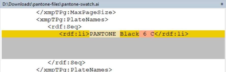
This is XMP metadata by Adobe (Specification) that defines how a printer should handle/reproduce the color.
FileB and FileC report a plain CMYK color value. FileA actually defines “PANTONE Black 6C”. This might be the most important difference for print based files.
2. The swatch list
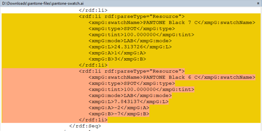
FileC never defined a swatch list in the file. While FileA has it defined and is still visible in the Illustrator color panel, FileB displays it as a “missing color”.
3. DocumentCustomColors / %%CMYKProcessColor
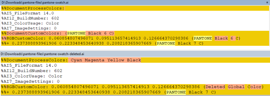
These properties seemingly define which color composition can be used to reproduce the selected color.
Before deleting the color swatch, this section reads as:
%%CMYKProcessColor: 0.479999989271164 0 1 0 (PANTONE P 157-8 C)
%%+ 0.600000023841858 0.540000021457672 0.479999989271164 0.280000001192093 (PANTONE P 172-12 C)
%%+ 0 0 0 1 (PANTONE P Process Black C)
After removing the swatch:
%%CMYKProcessColor: 0 0 0 1 (Deleted Global Color)Notice how the actual color definition does not change. It still responds as 0 0 0 1 (CMYK). However, the additional color mixing options (PANTONE P 157-8 C and PANTONE P 172-12 C) are missing. The definition for (PANTONE P Process Black C) is also now named “Deleted Global Color”.
This will surely also break re-prints of the same file. Please not that this entire block was not present for FileC.
4. The artwork data
Inside the actual artwork data, there is also a reference to our PANTONE color swatch in FileA. It reads /Separation/PANTONE Black 6C. The same area reads as /ICCBased for FileB and FileC.
Some surprises
During my testing, there was a thing that surprised me: Once a PANTONE swatch has been used in a file, the reference to it will stick around. Even after deleting every shape that used it.
This means to actually fully remove any reference to PANTONE (and remove the pesky popup), you have not only remove any shape that used it. You have to remove it from the swatches, otherwise they will live in your document.
What about other formats?
| Format | Result |
|---|---|
| SVG | No Pantone reference at all. Swatch is flattened straight to hex |
| EPS | Same structure as .ai — same strings, same differences |
| PSD | Same idea, same %%CMYKProcessColor-style block |
The workaround
So, how can we prevent Adobe from altering our files? From my tests, there is really only one way to at least keep the hex color values:
- Open the file before the block hits you
- Go to the swatches panel and delete the PANTONE entries
- Save
This will break the global color link. While the above changes will happen (and will change your source file), your PANTONE swatch will be swapped out by the hex representation of that color, keeping at least the correct color/shade.
But it’s not that easy
Because breaking this link is essentially throwing away the entire reason PANTONE exists. Your defined color in the PANTONE color definition is gone and you lose out of the very specific color maths PANTONE does to ensure your color looks right on different physical materials.
This workaround really only works if you’ve used PANTONE as a color palette, not if you actually used it for what it was supposed to be - A defined color set that works on any material.
Motives for the “black out”
This section is a bit more speculative, but I still want to talk a bit about this whole situation, because it feels odd to me. Adobe COULD easily add a button that does this “color swatch to hex” conversion for you. They don’t actually HAVE to reset your documents colors, even if it means losing some information. This might still be a viable option. But they chose not to. They chose to do this with a big bang, actually potentially hurting customers.
And I think this is done by design. It is clear that PANTONE and Adobe have negotiated for a while, and it is clear that Adobe needs PANTONE support as much as PANTONE needs the good will of the designer community. So a public outcry about this, against PANTONE, might be desirable in Adobe’s situation. It may lead to new negotiation options.
And if we look at the popup message again, it is written in a way that supports this theory. Adobe’s own CPO even publicly pointed finger at PANTONE.
And it’s not an unusual tactic either. Google did the same with a whole campaign directed at Apple over supporting RCS. (Edit: and it worked!)
This is annoying
And that’s the part that actually annoys me as a designer, because this dispute is between two very wealthy companies that both want to keep/earn more money and can’t find a solution.
The result of this public fight:
- Handoff between companies and departments gets harder
- More barriers in front of ordinary design work
- PANTONE was supposed to be the system so you don’t have to stand next to the press to check a color
- My files change, and there is nothing I can do about it if I want to keep the reference of the PANTONE color used
Epilogue: Writing about this without being a dick
When I initially wrote about this whole situation, I thought back at David Kriesel’s 2013 talk about the Xerox printer affair.
When he found out about Xerox scanners silently swapping digits in scanned documents, he did not make a big fuss about it. He first created test files, tested, and only then talked about it publicly. He didn’t just want to piss off a big company, he wanted to stay factual and get as much information before talking about it.
On his own “lessons learned” slide, he wrote the following:
First, contact people in a non-public way. The more personal, the better. Beware of twitter. […] From the start on, be a professional. Don’t yell, don’t hate, don’t exaggerate.
Now, I know I didn’t quite follow the first part of the quote. After all, my first interaction with this topic was on social media. But I do think that is fine, considering David had a situation with a much more serious implication.
But I did think about him while compiling these test files, reading the difference between two files with black circles on them. I didn’t want to come off as someone saying “HA, Adobe is so stupid”. I wanted to point at a possible danger. And I wanted to publish my method of testing so others can check my findings themselves.
And then WIRED called me
Three days after my initial post blew up, two very interesting things happened: Stuart Semple released Freetone, a color swatch of 1280 “extremely PANTONEish” colors as a potential drop-in replacement. Also: Chris Stokel-Walker called me for an interview about my tests and the designers angle on this dispute for an article on WIRED.
You can read the article titled Adobe Just Held a Bunch of Colors Hostage here: https://www.wired.com/story/adobe-pantone-color-subscription-fee/